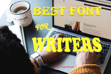
Best Fonts for Writers
Are you a writer or working on a writing assignment and wondering which fonts will make your work readable and appealing to your audience. This article is for you. Read on to find out more.
Best Fonts for Writers
Fonts are originally called typeface – meaning the face of what is being typed – that is – the look. Fonts (the more general term) refers to a single one or letter of that typeface. For example – ‘The’ is a typeface, while the letters ‘t’, ‘h’, and ‘e’, are called fonts. Other categories called fonts are letters with specialised characteristics – like bolded, Italicized, or underlined words.
In this article, I will have to use the more general term – font.
Several typefaces serve different purposes for writers. They are what you will love your writing to look like, but generally, there are typefaces out there that are unacceptable. Some typewriter fonts are in the modern fonts of today. When you use such fonts, you may have a unique work, but not everyone will be impressed with you. You are writing a comprehensible book, not JavaScript
code.
Does the fond I use matter?
Choosing your font goes hand-in-hand with the size of the font. To know the beauty of your work, you don’t want it messed up and bogus (undesirable). This is to say that the appropriate font modifies your work and proves its ambience. Several judgements passed on the font of any literary work are based on the readability, message, and ambience.
Read Also:
Figures of Speech in Literature
What Types of Font do we Have?
Do you have a font you love so much that you use it to write anything literature or a dynamic writer who can write with several fonts and keep them clean?
While typing with a cell phone, a WPS, or a computer set, you must have seen the different fonts provided or suggested by these sets. A number of them include –
- Calibri
- Times New Roman
- Algerian
- Garamond
- Cansu
- etc.
Sometimes, these fonts are used to achieve writing a particular type of literature. I do remember a time I participated in a Poetry competition – the required font was strictly Times New Roman, size 12. This was for a specific reason – to give the poem structure.
This finding made me realize that many fonts can be unreadable
– you may be asking why they were produced and kept there in the first place since they’re not serving any purpose.
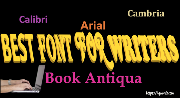
Some fonts that are often recommended for writers include –
- Times New Romans
- Ariel
- Calibri
- Book Antiqua and
- Garamond
Why many fonts that may not be useful to you?
Many of the fonts in your computer were produced by profound literates in the past. Several researchers point the production of fonts to Geoffrey Chaucer. Writings were first set using wooden types by hand, and then it was advanced to the metal type, and finally came the print type.
Does Font Size Matter?
Vast readers always come across several works with polished typesetting. Guess what catches their attention the most; the content. This makes typesetting less important to many readers and writers and the content extremely important – it should not always be about the sweetness of a novel – what about the formatting and the font? The system has made the font inferior, though it is the font that determines the clarity of a message.
Meanwhile, the font size plays an aesthetic role in the look and feel of the book. The recommended font size is 10 – 12, with 10, as the minimum and 12 – as the maximum.
How do I choose a suitable font for my work?
When choosing a font, you must determine the size it is to blend perfectly. This choice is to be made after you must have determined the length of your work. When your work is lengthy, your publisher may decide to use a page compressor or simply reduce the margins to make it blend in – this is because
the book already has many pages. The publisher also may decide to increase the number of pages of your book by increasing the font size to make your work look lengthy.
What to Consider While Choosing a Font
❖ Readability
Have you ever tried to copy a text from a fellow student or even your teacher and found the handwriting funny or incomprehensible?
Sometimes I prefer you dictate words for me to catch rather
than making my head spin like a carousel. Smaller fonts make the eyes suffer – it is advisable to make your font sizes stand between 10 – 12, with 10 being the minimum and 12 as the maximum.
❖ Audience
The first thing to determine is your audience. Consider your audience before choosing your typeface and font size. You are not writing for yourself alone. Therefore you must compromise. Your rhetorical question should be; what will my audience be, kids or adults? Will they be literate or regular people? Etc.
❖ Genre
Another important aspect to consider should be the genre of your work. Some genres desire a particular typeface and font size. I gave an example above of a competition requirement I came across in the past.
You may have to refer to that for a better understanding. You may need larger fonts for children’s books, designed to be beautiful so they can grab and sustain the users’ attention.
Summary
Whenever you are writing, considering your audience and the font you will use must be of utmost priority to you to achieve the desired aim.
You can write gibberish when you are writing for yourself, but for your to-be-published work, it must be well written with utmost care.
After writing your book for a larger audience, you will need editors who can help with grammar checks, proofreading, and formatting. Several agencies exist for this type of work. Just contact them. We also render such services here at HQ Words.
You must also know that your choice of fonts can dissuade or persuade your readers to take deliberate actions toward your work. Try to figure out the type of font that will be best for the genre you are writing – this will help improve the ambience of your literary work.